Wednesday, November 24, 2010

Let's get started on 2011!!~What is on the Horizon @ L. Green Studios, LLC

A few things on our list for the first of 2011 include...

2300 Peachtree

~Great New Studio Space at 2300 Peachtree
~Great New Talent Emerging with us
~18 Fantastic Projects
~A much anticipated trip to project in Panama
~Our Very First Showhouse
~Trademarks & Patents Pending Approval
~Signature Product Line Launching Spring 2011

 Photographed By: Blayne Beacham
One of the Residences we will be renovating in 2011

Photographed By: Blayne Beacham
One of the projects we will be designing during 2011...
 
We are thrilled to be growing and looking forward to
a wonderful 2011!!  Thank you to all our wonderful clients and
their continued support during our growing pains!!


Thursday, October 14, 2010

Preview for Tonights Party...


Tonight we will be exploring the art of Simple. Sophistication. ™ at the corner of Arden & West Wesley.  Come by to see how scale, texture and art should be balanced using classic design techniques as we use the owners amazing art collection to balance and dictate the best use of these three inanimate objects that used correctly will bring a room and your home to life!!  Hope to see you tonight!!!  xxlgt

RSVP Space is limited only 10 more spots open info@lgreenstudios.com

Wednesday, September 29, 2010

Sneak Preview...October Editorial 2010

TheSimpleSophisticate. ™

Recently I was doing a two hour consultation for a great friend of mine who happened to win a free in home consultation at our last Design Event with Sandy Springs Antiques & Interiors—well never knowing what to expect during a first time house call…

We explored using her existing collection to the best of its ability, rearranging her furnishings to equal weight and balance the space visually, here are a few tips you can try yourself:


1. Placement. When arranging, it is easy to try to ‘stage’ your home as you would see it featured in a magazine, however keep in mind, the homes you see in magazines are authentic but have been put together for the photo shoot, moving collections around to ‘force the shot’ is common at a photo-shoot…So in light of that, you need to arrange your home to live well not look like a magazine. In the photo below: we split the matching pair of French cabriole leg chairs with needlepoint cushion to further draw your eye around the space and to balance the visual weight of the settee on the far wall, the ottoman was also centered for a more layered approach. The only thing missing now is a large sisal rug to pull it all together.

2. Bookcases. The collector I worked with has a sophisticated collection of traditional art and antiques but a more transitional blend of upholstery with nickel nail heads and a pair of really great cabriole leg chairs cushioned in a classic French needlepoint. For her symmetrical bookcases a little tweaking was necessary. We pulled a fine china plates that were clustered around eye level to the top shelf flanking a pair of Oak Leaf objects. This allowed for a more balanced and warm feeling right off the bat.

Read more at www.theroswellcurrent.com this upcoming weekend...

Upcoming Events:
October 1 & 2nd Estate Sale 365 Plantation Way, Roswell, GA 30075 Open to Public 9-4pm
October 14 7-9pm Private Residence Recently Completed by L. Green Studios, LLC A Design Event Space is Limited RSVP info@lgreenstudios.com
October 18th Roswell Women's Event Private Design Seminar to inquire info@lgreenstudios.com

Thursday, September 16, 2010

Join us for a Fabulous Evening...

Won't You Join Us for a wonderful evening of decor & all the latest news in the design world? Would love to have you stop by this really wonderful private residence we have recently

completed in Buckhead October 14th from 7-8:30pm...Space is Limited so please RSVP to info@lgreenstudios.com


We were inspired by this wonderful piece by Liz Barber available at

Huff Harrington

in Atlanta, the residence took on a life of its own using the owners wonderful

collection of museum quality art and antiques we have

arranged it to its best use...


L. Green Studios, LLC

Interior Design

Phone: 404.276.0262  Fax 866.434.6978

Latest News:


What's Hot Now AH&L 2010:

Tuesday, September 7, 2010

Trade Only...no longer


A While Back we mentioned a rumor...well it seems it is no longer rumor but published fact...


Saturday, August 28, 2010

Carrying COLOR Throughout...a sneak preview

Sneak Preview of our Latest Editorial...TheSimpleSophisticate. ™

As designers we are setting the stage for a dramatic entry into each space we design. The major sight lines and impact zones in a project are carried through by an equal distribution of color and the visual weight it carries.

We are working on this really amazing home this month in Roswell that has layer upon layer of color mixed with a warm mink tone carried throughout the public zones. The clients are not afraid to use color or texture to carry the weight throughout and help me in balancing the overall concept. Of course, she isn’t afraid to use color being that at a very young age her work was featured in Vogue as a leading colorist for Fredrick Fekkai—5th Avenue NY, NY…


So getting back to what I was saying, color should be distributed with a sophisticated thought process—it needs to be present in a way so that it feels natural and planned at the same time. I always hear from people, how do you do ‘that’?? Well years of training and work are the real answer, but you can do this too with a few simple steps:

To Keep Reading visit www.theroswellcurrent.com at the first of September...
 
© Copyright 2010 L. Green Studios, LLC

Tuesday, August 24, 2010

September Issue Atlanta Homes & Lifestyles...

September 2010 Issue of Atlanta Homes & Lifestyles

Special Thanks to the wonderful editors & publisher of Atlanta Homes & Lifestyles for the mention of us in their hot new September Issue...

Happy Reading...If you have not...checked out their blog, I highly recommend it for a great local and not so local vantage point at the same time...

Sunday, August 22, 2010

The Art of Simple. Sophistication.™


And Using What You Have Well!!  We continued to explore ratios & scale focusing on design, while we put together two rooms using the philosophy of Simple. Sophistication. ™ at Sandy Springs Antiques & Interiors. 

The room pictured is the second vignette we designed, we used multiple layers of unexpected finishes including--an urban stainless steel chest paired with a vintage Trumeau Mirror and rustic whitewashed columns turned floor lamp.  Special Note: These rooms were pulled together in 30 minutes using what we could source in the store only...A few style tips to follow:

Here is one of the rooms we designed while you watched last Thursday...
Style Secret: There is no secret, it is all about the art of scale & balance.  It does not have to take a small fortune to put a room together well, it takes a few simple rules & a bit of training.   Both of the rooms we put together each of their combined cost was under $11K.  That being said of course, we work with all types of budgets using each piece to the best of its ability...Whether your budget is $5k, $50K or $500k it is possible to achieve your design aesthetic and enjoy your edited lifestyle!!!

Style Secret:  Using each piece in your collection in its best use, then purchasing with a trained eye or at least discerning can save you money and energy in the long run.  Most of my clients own wonderful found/inherited objects & pieces. Edit your collection and then source as needed new pieces to finish it well...What you choose to let go is every bit as important as what you choose to keep!!

Style Secret:  As you edit make sure you study the symmetry and asymmetry of the space plan & architecture.  Once your plans have been tweaked and well thought out--look for the perfect finishing pieces.  It is almost like putting a puzzle together backwards...

Special Thanks to:
Rhonda & Associates of Antiques & Interiors of Sandy Springs
Atlanta Homes & Lifestyles
The Roswell Current


6336 Roswell Rd. NE

Sandy Springs, GA 30328

Thursday, August 12, 2010

You Are Invited...A Design Event

You are invited to join us for our biggest design event of the year...Bring a friend or two while we uncover the art of Simple. Sophistication. ™ while we put together a room of your choice while you watch. 

Thursday August 19th 7-9pm


Sandy Springs Antiques & Interiors hosts us while we use the principals of scalability, balance and symmetry to deliver a room on budget.  Space is Limited RSVP info@lgreenstudios.com


Wine & Cheese will be served

Thursday, August 5, 2010

Panache in Layers...


With these salmon colored cut velvets, box quilted and handpainted linens


we are seeing a return of color and emphasis on the piece determining the collection...


In the midst of all these incredible layers of fabric a design for our latest project in Panama is coming into view...


Wednesday, July 28, 2010

Before & After...

We have heard from many of you that you would like to see a few before and after shots of a some of our projects.  So here is one of my recent favorites!  This project was not a do-over but a use what you have well and edit/redo what needs doing in Houston, Texas. 


We edited the prior bachelor pad and incorporated both spouses aesthetic into their combined home. 


Using timeless whites and a better space plan we edited it to achieve a better sense of place...Enjoy!  Laura

Friday, July 23, 2010

What is Simple. Sophistication. ™???

As We Explored the Art of editing your collection at Now & Again yesterday, we also uncovered our philosophy of Simple. Sophistication. ™ :


To put it 'simply'...

1.  Using your existing pieces to their best ability (both function & aesthetic)
2.  Living well with what you have and knowing when to get rid of pieces you have so that your great objects stand alone in their proper place.  Knowing that of your budget there are ways to make it go further than others--choose wisely!!
3.  Knowing that when you choose to edit and downsize or regroup part of the cleansing process is to let go of the 'wrong pieces'
4.  When you let go of them, instead of donating them, consign them or list them on the appropriate online service to try to recoup a little cash to stretch your budget...
5.  With the little cash you recoup apply it forward to your design plan to make your home a simple sophisticated place to live well and enjoy life's best moments. 


We also explored in the Q&A Session immediately following a few how not to do's and a few how do I do's!!! 

1.  When you are looking for a great piece of upholstery remember it is not always more economical to buy used and recover at 16-20 yards of fabric even if it is $20 per yard you quickly end up topping $2,000 for a redone sofa that may or may not leave you desiring more for comfort and aesthetic. 
2.  Remember to let your homes architecture dictate functional aesthetic when it comes to panels that would interrupt a door swing.
3.  In a room centered in your home with no windows and doors--lacquer the paneled walls and add two pairs of sconces to brighten the space and add architectural interest, layering books and objects of art to further set it apart visually. 


Would love to have you join us for our upcoming event at Sandy Springs Antiques and Interiors as we put together a room while you watch!!  August 19th 7-9pm to RSVP info@lgreenstudios.com space is limited reply soon...

Tuesday, July 20, 2010

Won't You Join Us...a design event

Won't You Join Us for a design event at


We will be discovering the art of Simple. Sophistication. ™  and editing your collection as we peruse Now & Again's collection of antiques and original pieces.  Mimosas & Muffins 10:30-12pm This Thursday July 22nd
56 East Andrews Drive NW, Atlanta, GA 30305  404.262.1468 Space is Limited to RSVP info@lgreenstudios.com

Bring your Questions a Q&A Session immediatly following...

Friday, July 9, 2010

Parisian Apartment...Wonderful Things for the First Offer

It is no Secret that the economy and spending are down, that has created this wonderful saturation of pieces at bargain prices!!  If you find yourself positioned for being Shop-ortunistic here are a few deals you do not want to miss...


Simply Amazing French Piece hand painted by Addington Osborne Ltd. now opening a new location in California--bring an offer, we have a reserve number but are willing to hear any offer and consider...It seems it is simply a matter of priorities in life...Cheers!


From a wonderful shop in Atlanta called The Gables...Recently appraised for over 16k...bring any offer to consider...


Beautiful Carved Queen Bed Upholstered in a Creamy Vanilla Latte Cotton Matelasse...Interested make an offer...
Contact us to reach the seller at info@lgreenstudios.com

Wednesday, July 7, 2010

Sneak Preview...Westgate Phase 2


We had the best of times installing phase 2 at Westgate Houston, Texas.  Here are a few sneak previews of a few shots--the rest will have to wait as we have a few editors looking at this project...Enjoy!


I have always loved the juxtaposition of a creamy cold marble and a venetian gold finish together, the perfect balance of tones!

More to come...

Monday, July 5, 2010

Kuhl-Linscomb. Sensory overload in Houston...


My client and longtime friend mentioned that there was this wonderful designer, Pam Kuhl-Linscomb, ASID, who has an amazing shop in Houston that we must stop in while installing the second phase of her home.  Well...That was an understatement to say the least!!


Amazing Collections of Linen, handcrafted papers, wonderful porcelains and interesting objects of interest fill a light and airy space.  The way the space flows from building to building and the transitions are beautiful.  The attention to detail and obvious perfection achieved is wonderful--you must stop by if ever in Houston...


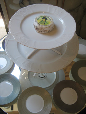
Displaying only the most intricate collections Kuhl-Linscomb proudly carries one of my favorite patterns and the pattern used by my client in Houston.  That of Robert Haviland & C. Parlon ~ Recamier Range, Syracuse ~ Inspired by the Greek motifs of Syracuse ~ described by Cicero as the greatest Greek city and the most beautiful of them all. Syracuse is once of the designs of Arielle de Brichambaut, French artist and dinner service designer.


Isn't It Incredible the swirls, and dots seem to stack themselves architecturally on the plate surround?  I can hardly wait to formally photograph Westgate and have the dining table set perfectly in this wonderful china...


Now for a decidedly different twist--I am not sure I would be dying to snuggle up and watch a move in this chair but it would be fascinating to have in an entry used as a sculpture or other focal point--love the layered loops.  What do you think, would love to hear your thoughts??


We stumbled upon these really intriguing chairs that could be so great in a studio space--I am considering using them in the one we are designing for our future office at the moment--see the blue ones in the middle portion of the image?  We will use these at our conference table set of eight around this classic marble piece for the table with a wonderful Vintage Crystal Chandelier...


Here we noted the feeling of a wonderful loft looking over a skyline--love these mirrors...


The overall ambiance is so wonderfully creative, that even the most linear thinker would be inspired to grab a handful of paints imitating Piet Mondrian!!


We were sad to say goodbye, and will definitely be planning a purchasing trip for our projects to Houston in the very near future!!  Thank You to Kuhl-Linscomb!!


Kuhl-Linscomb Design Firm was established in 1984. Prior to 1984, Pam Kuhl-Linscomb, ASID, worked in management and buying in the retail/fashion industry after graduating from the University of Texas in fashion and design.
Wednesday, June 30, 2010

Lone Star...Texas or Bust...

All Images Photographed by: Maggie Wooldridge Campbell
The Lone Star State amazed me as we explored different venues and learned to appreciate the collections of various dealers and showroom owners.  Particularly fascinating was the collection at Abraham's Rugs, with a noteworthy clients, Sam Abraham began his collection in 1974...


We spoke of different tribes and families in Iran, Turkey and India perusing so many wonderful rugs.  The colors and knotting techniques intriguing and beguiling at once.  The patterns of the Oushak and patina of time make them universal in their inclusion of simple and monochromatic design intentions.  The wonderfully aged Serape & Sarouk rugs took my breath away as we looked at detail that one can only imagine in some faraway place was knotted by hand in a pattern so intricate that it puts the Sistine chapel on the same plane. 


This one amazing piece had this form  repeated over and over again reminding me of a Nautilus pompilius, cephalopod. 


"Fun with Math as far back as the ancient Greeks, the shell of the chambered nautilus has been a symbol of perfection. This shell can be described mathematically as a logarithmic spiral. It is often confused with a very specific type of logarithmic spiral that the Ancient Greeks described. This special logarithmic spiral has a ratio of 1:1.618 and is called The Golden Ratio or the Divine Proportion (See: The Nautilus Shell Spiral). In truth, while Nautilus is a beautiful example of a Logarithmic spiral, it is not in the proportions of The Golden Ratio. Please see the article by John Sharp that proves this." 


Here are a few of the amazing pieces we unrolled during our design seminar at Abraham's Rugs, Houston, Texas.  Special Thank You to Sam Abraham for hosting the event. 


Houston Decorative Arts Center