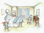
We have heard from many of you that you would like to see a few before and after shots of a some of our projects. So here is one of my recent favorites! This project was not a do-over but a use what you have well and edit/redo what needs doing in Houston, Texas.
We edited the prior bachelor pad and incorporated both spouses aesthetic into their combined home.
Using timeless whites and a better space plan we edited it to achieve a better sense of place...Enjoy! Laura


Laura, love the way you use neutral colors to bring serenity and focus to the space. After years of color saturation, the simple and fresh design is the ultimate in sophistication.
ReplyDeleteLooks great and feels completely different!
ReplyDelete