
Editorial By: Laura Green Thome;May 2010 The Roswell Current;http://www.theroswellcurrent.com/
Sophistication used often, but rarely defined well~ in homes it seams anyway! Most of us live a cluttered life and an overwhelmingly distracted existence. Par for the course for most everyone with all the gadgets and devices we use frequently. Simply defining your style and color palette along with a little or a lot of spring cleaning will help you incorporate a more sophisticated approach to day to day life. Many of you have written in and requested actual color recommendations. So here we go-keep in mind hours upon hours are spent by designers in color theory classes and studying color, hues, shades and tones. So my recommendations are limited at best in their application to each consumer—that is why there are so many options to suit each individual best!
Let’s start with one of my favorite color teams. Experts forecasted color this year as being vivacious, fun-loving and lively for the season. Here is a color sampling of what is in store for the duration of the year from Pantone’s color forecast 2010:
If you are ready to paint your living room this season try Farrow & Ball’s Arsenic in a pale room full of neutral furniture, have it mixed in a satin finish and try three coats with a glossy glaze on top. The resulting color intensity will evoke a fresh invigorating feeling as you pass through and enjoy evenings at home during the coming months. In the fall try adding a few indigo colored throws around and adding a chunky hound’s tooth fabric on a few ottomans with dark architectural legs. Also introduce a few dark indigo lamps with chocolate card shades for another layer of richness. You will want to drink this color up all year long!
It is of the utmost significance when balancing color intensity with crisp definition to use natural fibers and nubby woven textiles in combination to form a wonderful warm palette. While using solids introduce a few organic linen prints or tobacco leaf prints as a focal point on a settee or as a drapery panel. Many times I use a tobacco leaf print coated in vinyl as a powder room wallpaper. This adds an element of both confidence and comfort, organic patterns are so important in adding that touch of personality whether light and airy or stunning and contrasting, go ahead and introduce a few patterns to your palette.
If you are wanting a bright and cheery sunroom or breakfast room after this years long cold winter~Try Farrow & Ball’s Citron in ½ strength formula. The color will intensify in large areas so make certain with a sample pot that you like it’s acidity for your home. If you have the panache to carry it you have the talent to put together the proper art and accessories—I assume?
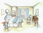
On the subject of panache, I absolutely love pistachio’s are they related, of course not! But it did remind me that my favorite Guest Room I have ever worked on was the color of a pale pistachio ice cream and we used it in combination with ivory lacquer on the bed and Ivory/Taupe subtle strie on the drapery panels. The bedside table was an antique primitive American piece done in a walnut. It was so simple but just called you to have a mint julep and unwind after a long day…For that color try: Pantone Paints, Luminary Green 12-0525 similar to Endive shown above. Shown here is a recently completed Great Room in Atlanta done in a crisp and understated green, we contrasted the wall color with crisp Belgian Linen Panels balancing the simplicity with a few Hinson & Bergamo Fabrics.

According to Devoe Paints Color Psychology: “If green is your favorite color, this indicates stability, balance and persistence. Organization is fundamental to your environment. When you start something, you finish it. You tend to be honest, moral and sensitive to social etiquette. Exceptionally intelligent, you understand new ideas and before making decisions, you recognize the importance of having all the details and considering outcomes.” Check out other impacts of color on your mind at: http://www.devoepaint.com/Jahia/home/color/clrcolorpsychology
No comments:
Post a Comment