Monday, March 21, 2011

Simply Beacham

What seems to be lacking in 21st century design is the soul of the space and this can not be fabricated. It must come with the person attached to the space and that was my inspiration when decorating Blayne Beacham's house. We combined her style and innate personality with Simple. Sophistication.™ to infuse color and balance throughout her home.  The bones of her bungalow were perfect to layer with art and dramatic contrast in color, so let's take look at the finished product! 
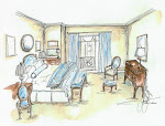
The dark anthracite tones in her Guest Bedroom are paired with classic white frames and panels, this allows the space to breath and collect visual impact with the delicate balance of the objects.  The Ceiling was painted the same color to bring the eye upward and diminish the low ceiling height. 
Style Secret: You should try this in your own home, if you have low ceilings paint them the same color as the walls to elongate the sight lines and bring the detail to life. 
In the Living Room and Studio Space we layered objects of art and pieces that have sentimental value to Blayne as decoration.  All too often I find that decoration for it's own sake is tacky and lacking personality.  What draws us each to one another and to spaces is the persona and emotion that goes into it.  If you can capture that by finding objects that have meaning you will allow the room to take on its own life and increase the ambiance significantly. 
My favorite piece is the blue boards on the wall in the Living Room which were thrown in at the last minute while we felt it was too contrived before they added a bit of spontenaity and attitude to the clean space. 
The bookcases were of course my favorite thing to do as we spent hours putting the house back together again we realized that they were of course lacking!!!  We added piece by piece editing as we went the final favorite is the pair of heels Blayne wore to her first art opening, used as art and balance they brightened the space.
Striking a balance between dark and light is very hard to achieve, but in this space we evened out the visual weight of her home by adding bright statement pieces.
A floral arrangement, alluding to her carefree style, using a plastic polka dot wine glass to house a nested group of open white roses is an example of one of the light objects we used to brighten up her house!
Back in the day, Blayne's counter tops would have been called pea green, but the newly refurbished 'peridot green' counter tops gave us some color to work with in her kitchen. Pairing her 'old school' laminate counter tops with a beautiful picture and some bright flowers gave her kitchen a whole new personality.
Style Secret: Lamps don't always have to be ugly. In her master bedroom, we found lamps that were not only functional, but also were pieces of art. It is a great way to save money and add personality at the same time!
Then, we translated her space into a three dimensional environment as we incorporated objects of art and of personal interest to ‘decorate’ her home. For instance, on the coffee table we layered a adorable little birds nest over a Vanity Fair Book filling it with vintage flashbulbs she collected at a market—hence decorating as it is meant to be authentically expressing emotion as objects.
It is not some cheesy object bought for its form from some tacky store where you paid a fortune for something imported from China, it actually means something which gives emotional balance to the space.
In your home, try infusing the things you are drawn to into your space, if you like to wear fuschia throw a few pieces of art with fuschia in and feel like your home represents your personal style. Stop trying to copy everyone else!!
Blayne Beacham's house turned out to be the perfect mix of personal touch and sophistication. We had an absolute blast decorating her bungalow and I hope you have learned from this project that it isn't always about filling your house with expensive things. A home is a lot more welcoming than a house, so don't be afraid to live in it!

XXLGT
Visit Blayne's blog at http://www.thisphotographerslife.com.
Wednesday, March 16, 2011

L. Green Designing Philosophy

A journey into a client’s mind is an amazing revelation. When you, as a designer, reach the point where designing is no longer about the passion of creating your vision in someone else’s home and realize it is learning to see through their eyes and create for them a space that is contiguous with their life and experiences, you reach ultimate satisfaction. In essence, your experience comes full circle and becomes owned by your client.
When I first started designing I thought it was all about me, but then I realized that I was pushing too hard on my client’s parameters to reach a selfish objective. This experience is not rewarding in the least and isn’t authentic to my client’s vision.
I began this journey of trying to use my talents and learned expertise, applying them practically layer by layer to create a unique project whose sole focus was to reward the home owner who ultimately is the recipient of my work. So in short, starting to focus on the long term effects of my work, both psychologically and functionally, increased the long term relativity of the ‘brand’. Hence, the term “simple sophisticate” was born... the parallel between being simple and the application of sophistication.
What most designers lose sight of is that a client typically spends only 1-5 years planning, designing and building their home, then they live with their decisions for 13-30+ years. Instead of making the most money or worrying about being published, one should be concerned with the functional live-ability of the space and its ultimate goal of being an investment vehicle for their portfolio. When my focus shifted to being a good steward of my client resources, the entire process changed for me. They in turn started realizing that it is possible to both save money and achieve their dreams. The possibility that this brings is endless to both the consumer and designer.
As the designer builds their brand and their buying power, they are able to achieve the symbiotic relationship of having both a large revenue stream and passing along a great discounts to the consumer. Being shortsighted, you realize not only does it impede the design collaboration and the pricing model, but in some instances it actually keeps the project from being completed. Now when money is no object it actually is not a problem, but I have yet to meet a millionaire who doesn’t count a penny!!
I love my job and all of the relationships I build with my clients because most of them turn into genuine friendships, like our next design story with Blayne Beacham. She is the director of creative services at Beacham & Company, Realtors and one of the most talented photographers I have ever met! She is also the principal photographer of "The Beacham Series" magazine and writes her own blog called "This Photographers Life: In Search of a Style". I had the honor of decorating her house not too long ago and it turned out perfect!
If you want to visit her blog, go to
http://www.thisphotographerslife.com/. Stay tuned for the full critique of Blayne Beacham's house including pictures! Here is a sneak peek at one of the rooms.

Monday, March 14, 2011

Simple. Sophistication.™ From the Ground Up. Part Two

The second part of our shopping trip was concentrated on lighting and the different types of fixtures that caught my client’s attention. I recommend to start with formal accessories at the front and then slowly work your way to relaxed and functional pieces as you move through the house. The first two types of fixtures we looked at where pendant lighting and flush mounts. A pendant light can be used as a signature piece at the entrance of your house or can take on a more casual appearance in any hallway. My client fell in love with this light immediately because of the youthful, yet classy appearance of the canvas material.
Flush mounts are a must-have lighting fixture, but as I always say, a functional piece doesn’t have be to ugly! My client and I found the perfect example of a flush mount that is so beautiful that it might end up replacing a chandelier in their master bathroom.
We both loved the crystal details, the fabric lining and the price because it costs half as much as a chandelier would! This is what I call a statement piece on a budget.

The next thing we discussed were sconces. I love using these wall fixtures in bathrooms on either side of a decorative mirror, so in my client’s house, we are looking into displaying them in her powder room.
Style Secret: Fabric lighting fixtures require less maintenance overtime compared to glass.
On the same topic as wall fixtures, I want to quickly rave about bath bar lights. I recommend them for all women because if you have one on each side of your mirror, they evenly light up your face when you put on your make up. I know I am not the only one who puts their make up on in my daughter’s bathroom because it has the best lighting! Don’t look for them to add any decoration to your room, but for functional purposes, they are nothing short of amazing.
This next piece was sold the moment my client and I laid our eyes on it. Not only would it match all of our nickel appliances in the kitchen, but it is aesthetically pleasing to the eye and is effortlessly detailed. We are planning on white cabinets, and I think the combination of wood and nickel creates a great contrast! The island lighting fixture we plan on purchasing is going to have nickel shades instead of fabric.
The last part of our lighting extravaganza trip spurred from my client loving to read books in her bed at night. She showed me some swing-arm lights that she saw in a magazine, but I don’t recommend them and here is why. Even though they are very functional, they are easily worn out and start to look shaky after a while. I recommend installing recessed lighting in your ceiling that can be controlled bedside that will light up your book from above!

 
I am really excited with the progress we have made in this short amount of time in this house. Designing on a budget is always challenging, but anyone can do it! Everyone given the opportunity is going to pick the nicest appliance on the market, but if you are realistic about your purchases, you can save a lot of money.

Wednesday, March 9, 2011

Simple. Sophistication. ™ From the Ground-Up

Happy 2011!

I want to first apologize for our short absence on here. Busy would be an understatement to describe our year so far, but now that I am back, I wanted to introduce to you a new blog series we are going to be doing. My newest project is for a family that is building their dream home and they have chosen me to design everything from the ground up! From picking paint colors and furniture to choosing appliances and lighting fixtures, I will be exploring each intricate piece with you and answering all of your questions along the way. I think it will be very interesting for all of you to read about our progress on their house over the next year and in the end, I will show you, room by room, the final product... Simple. Sophistication. ™! My goal as a designer is to bring a unique and functional aesthetic that combines both statement and simple pieces to form a sophisticated, yet functional home, so join us on this journey of design.
 
First Shopping Trip!
-Castro Design Studio
The first time I take a client shopping, my goal is to not only get to know them as person, but to also start to understand their vision. In order to achieve this with my new client, I took her to Masterpiece Lighting to get a feeling for her taste in color, shape and texture.
First thing on our list... Plumbing. When it comes to buying these appliances, I suggest to start with the Master bedroom and Kitchen, then finish with the secondary bathrooms.
In this case, my client also needed plumbing in her powder room, so we had six rooms to do!
Style Secret: Don’t ever mix and match plumbing appliances! It is like wearing two different earrings!
1. Master Bathroom: Allow yourself to splurge in this room! We chose to do polished nickel Rohl appliances because of the warm yellow tint it gives the room. She fell in love with a high, skinny neck sink faucet with lever handles instead of knobs because of her arthritis pain.
Style Secret: If you have problems with your joints, replace all of the knobs in your house (doors and sinks) with levers.
When it came to the shower, there were a few more options to think about because there are three different types of shower heads. If you are looking for cleaning purposes only, the hand-held or standard shower head should be sufficient, but if you like relaxing showers, you should take a look at the rain version.
My client chose the best of both worlds and we are going to install a standard head on one side and have the rain head coming out of the ceiling in the middle of the shower.
2. Kitchen: Chose to do a brushed nickel Rohl sink with a bridge neck because of it adds personality to this room.
Style Secret: Polished appliances, depicted above, look great in kitchens, but they show water stains! I prefer a brushed finish because it doesn’t require as much maintenance, while still looking wonderful.

3. Powder Room: This room is going to be the most visited room by guests behind the kitchen, so don’t treat it like a standard secondary bathroom. I am looking to making this room funky, yet still classy for my client, so we might be extravagant with Rohl appliances here as well.

4. Secondary Bathrooms: These other three rooms is where we are going to save some money, which will allow us to splurge in the master, kitchen and powder room. Standard low neck sinks and shower head in a brushed nickel finish by California Appliances will look great in the other three bathrooms, while staying consistent with nickel throughout the house.

Stay tuned to learn about the art behind light fixtures!

Exciting Upcoming Events...

We are thrilled to be having a few upcoming events in March 2011!!

Join us for a Sneak Preview of our collection
and other style secrets on March 31, 2011 7-9pm

at our new studio
2300 Peachtree Road
Suite C-203
Atlanta, GA 30309

Also a fabulous private shopping event to follow
April 1 & 2nd...more to come!!

Mark your Calendars!!

Recent Schematic for a fantastic
 study we recently designed...